.png?table=block&id=8db8a7f4-157e-4639-9a7f-15c25f20e73e&cache=v2)
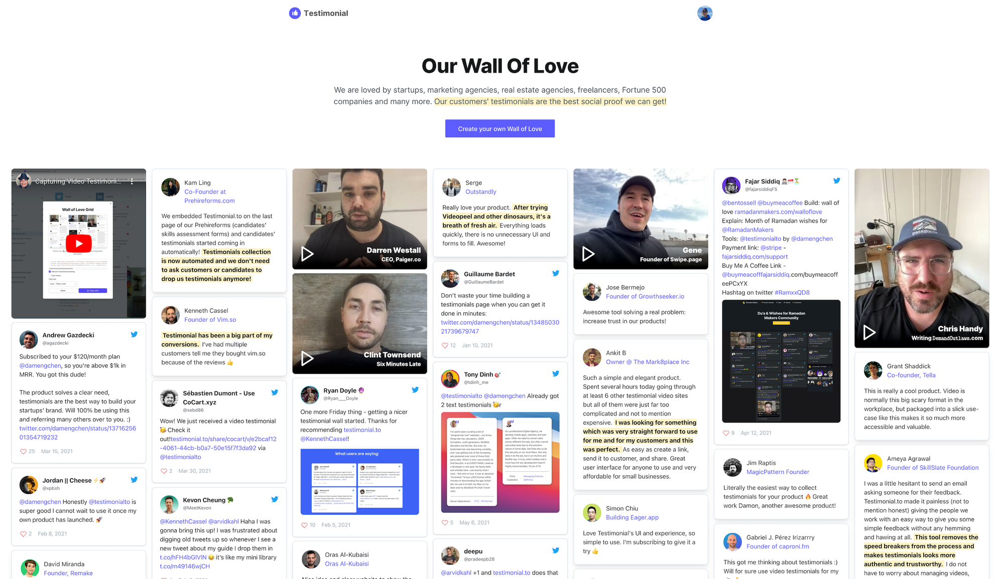
The Wall of Love is a place to host all liked testimonials. Things can be added to the Wall of Love:
- Video / text testimonials
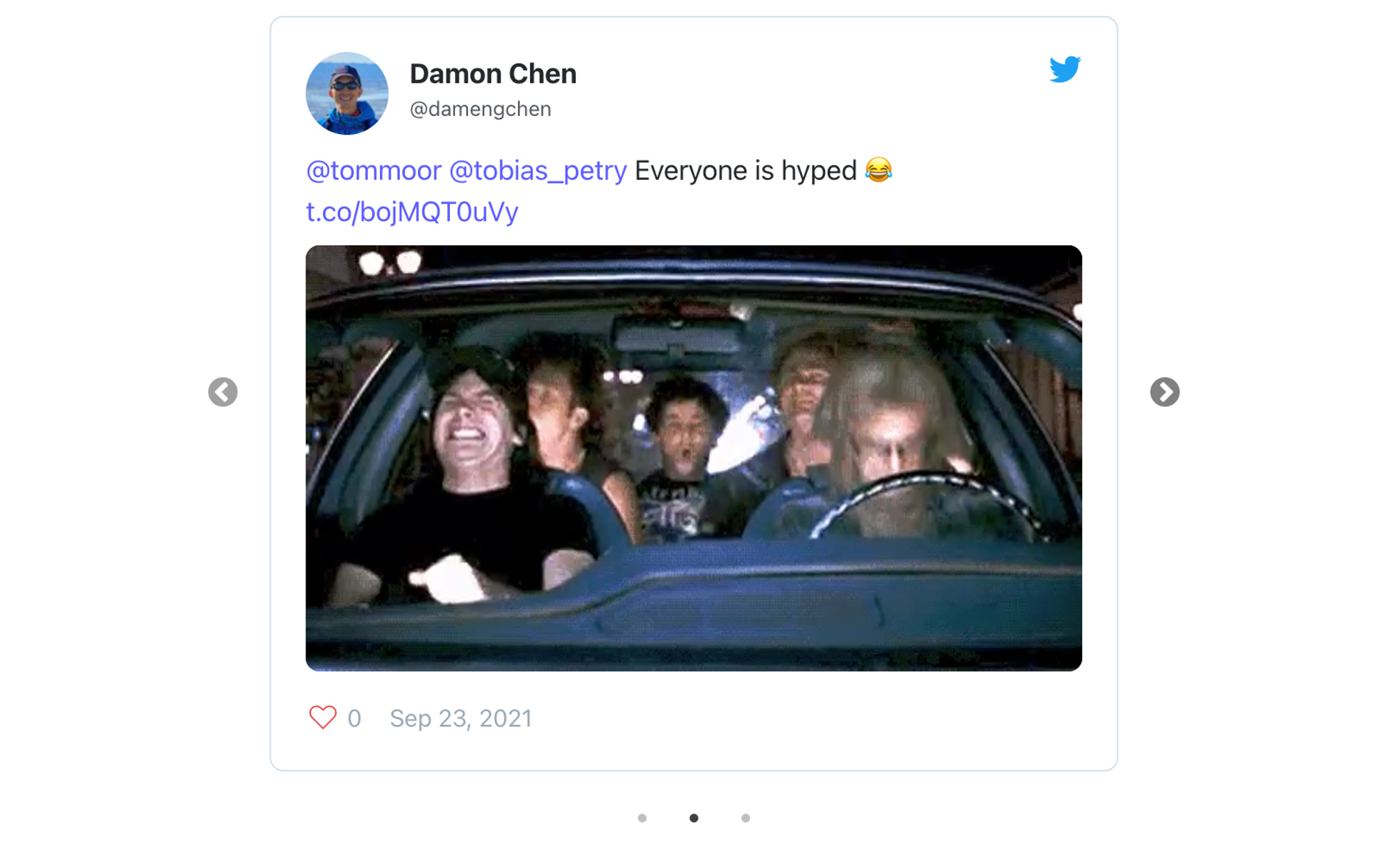
- Twitter tweets
- LinkedIn posts
- YouTube videos
- Vimeo videos
- G2 reviews
To have a white-labeled wall of love, please upgrade to any paid plan.
Embed optionsGeneral instructionsCustomize the Wall of Love masonry gridCustomize the Wall of Love carousel sliderSelected liked testimonialsSome hidden configurations for the carousel slider
Embed options
We support 2 different layouts for the Wall of Love:
- Masonry grid
- Carousel slider
For the content being display, we support 2 options:
- All liked testimonials
- Only selected ones
If we do simple math, you can have 4 different combinations:
- Display all liked testimonials in a masonry grid layout
- Display all liked testimonials in a carousel slider layout
- Display only selected testimonials in a masonry grid layout
- Display only selected testimonials in a carousel slider layout
General instructions
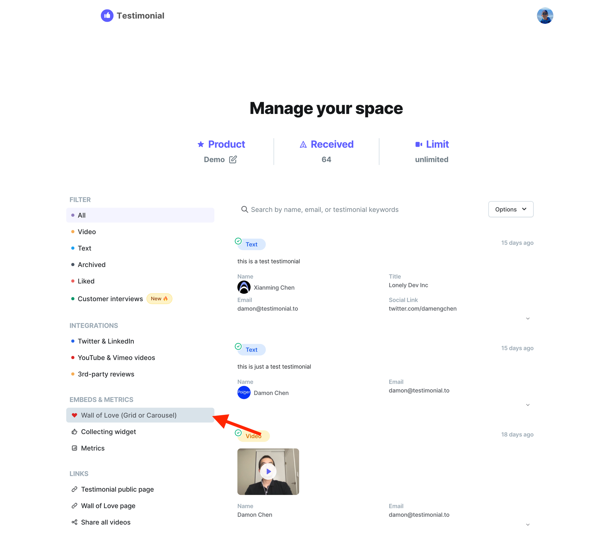
First, go to Manage your space page for a specific space, from the sidebar menu, click Wall of Love (Grid or Carousel)
You will see a popup modal like this 👇 This is Step 1, you need to choose a layout.
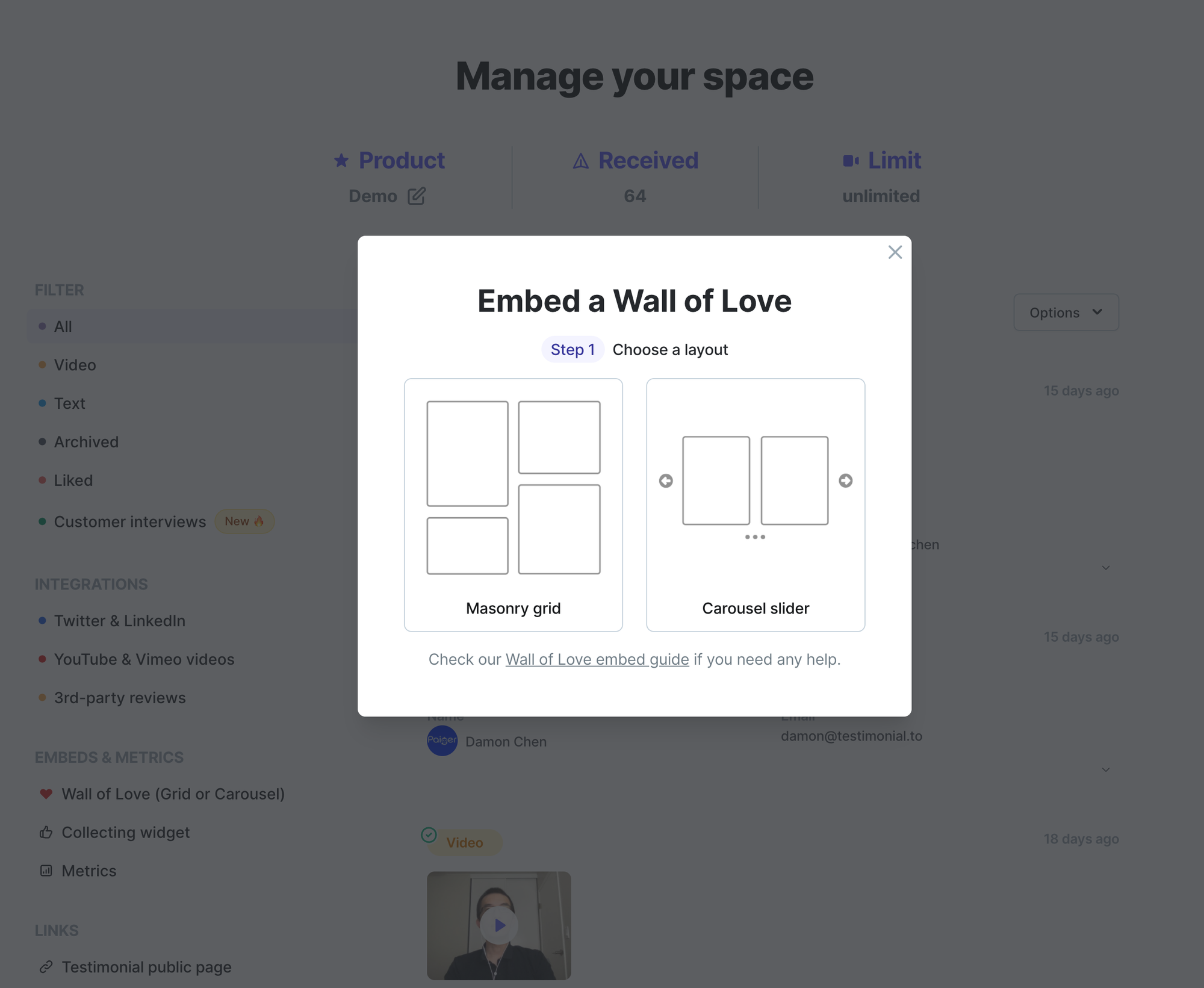
Assume you choose the Masonry grid, click the left card, then you will see Step 2. This is the step you need to choose whether to display all liked testimonials or only a few selected ones.
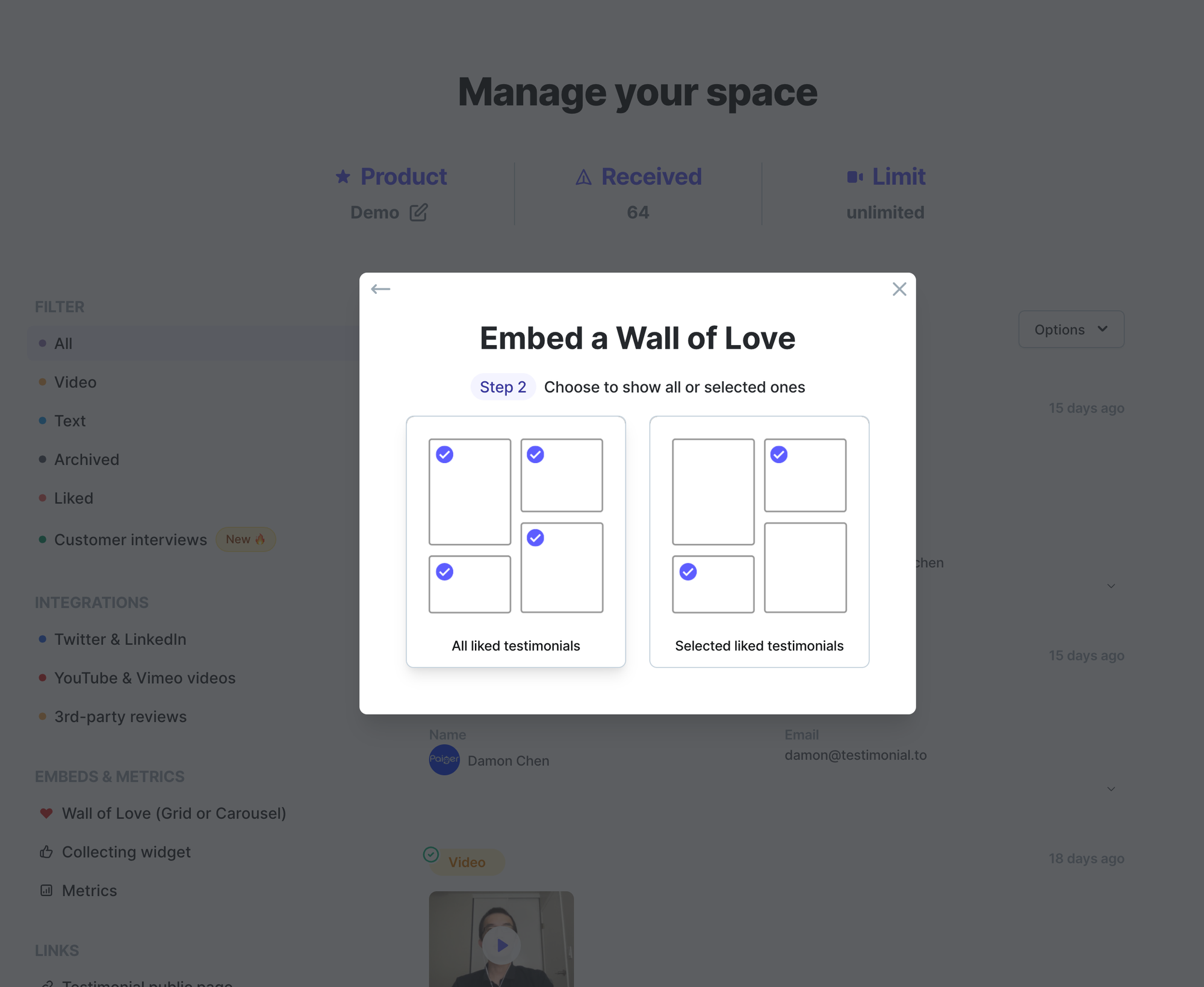
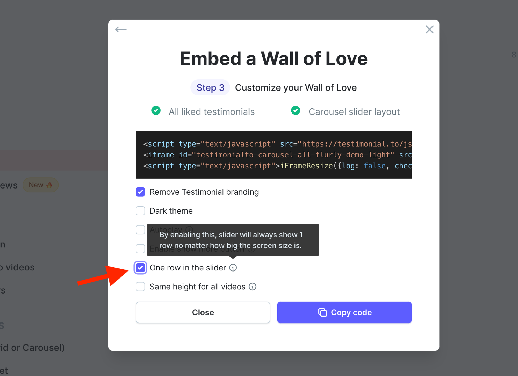
If you choose All liked testimonials on the left card, you will see Step 3. In this step, you can add some customization to your Wall of Love.
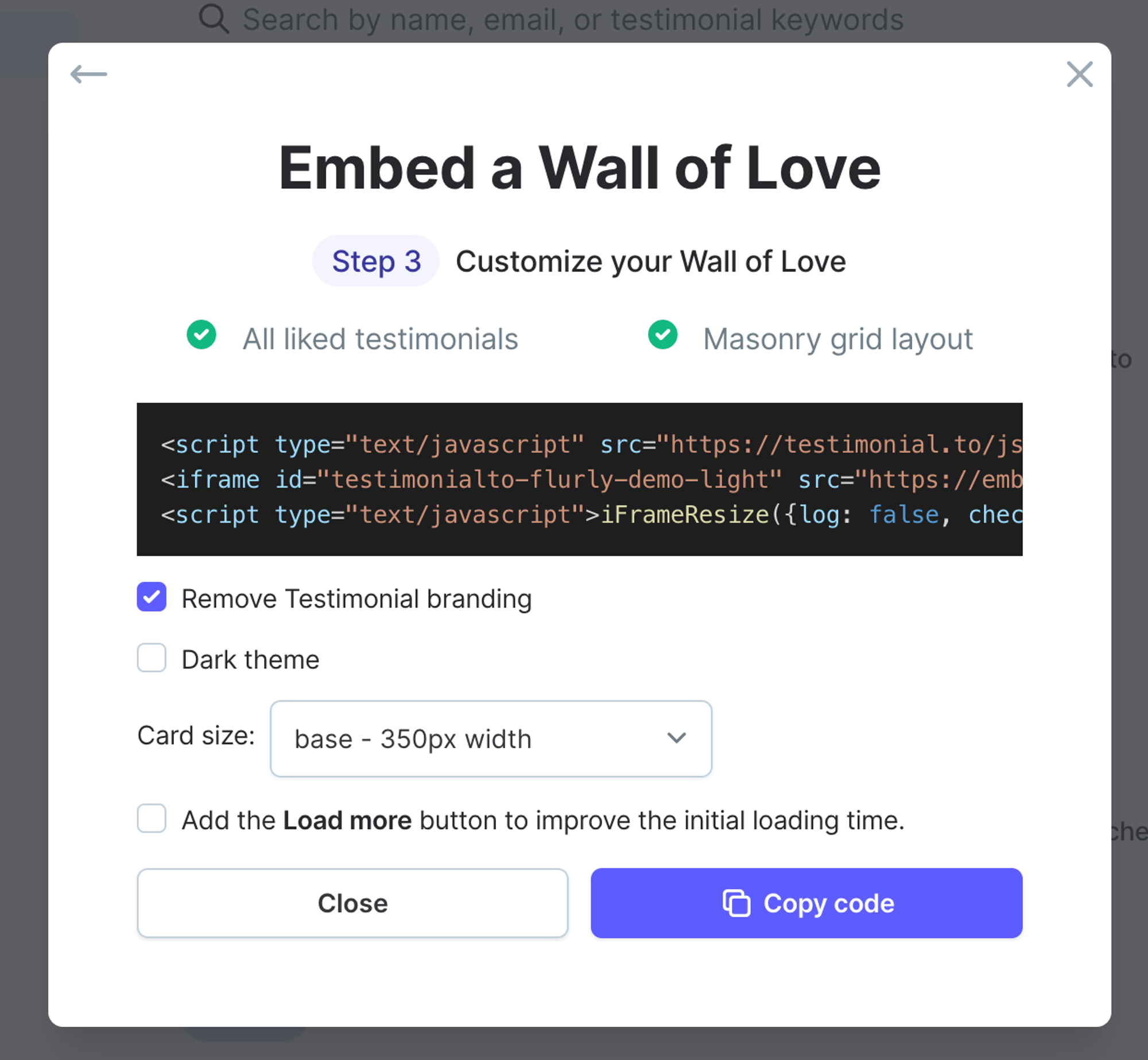
Customize the Wall of Love masonry grid
For Wall of Love in a masonry grid, you have 3 options to customize:
- Remove Testimonial branding (available for paid plan users)
- Choose the dark/light theme
- Set the card size
- Add Search Bar to allow users to search keywords
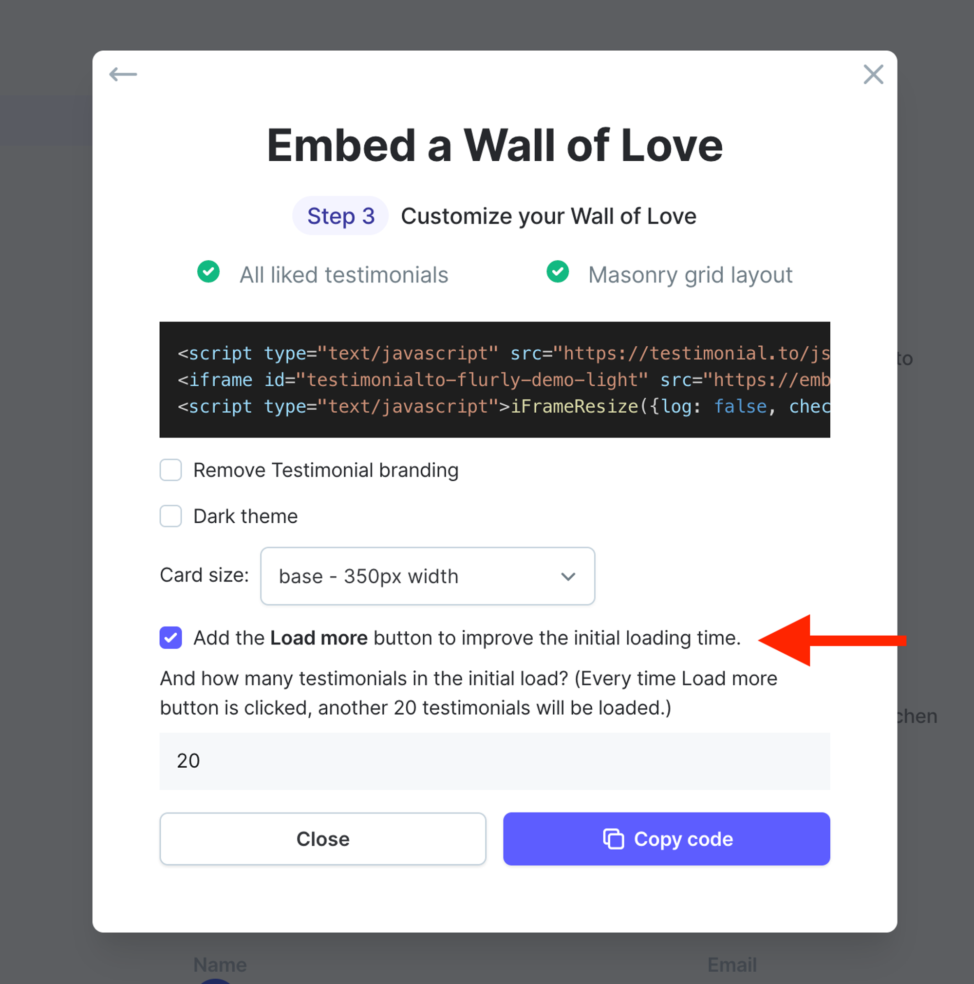
- Add Load more button for big walls to improve the initial loading performance
For the Card size, each box in the Wall of Love is a card. By default, the width for each card is 350px. You now have the option to customize the width as well. We will provide two choices:
- small: width is 250px
- large: width is 450px

When the screen size is smaller than 500px, the wall of love will be just in one column, and the width of each card will extend to 100% of the screen width.
For Load more button, when the checkbox is selected, it will show another input field down below asking how many testimonials in the initial load of the Wall of Love.
Minimum 20 testimonials in the initial load. For the load more button, every time it's clicked, another 20 testimonials will be loaded.
Here is a live demo of Wall of Love embed in the masonry grid format:
Customize the Wall of Love carousel slider
If you choose Carousel slider as the layout, then, in the end, you have all the following options to customize the carousel slider:
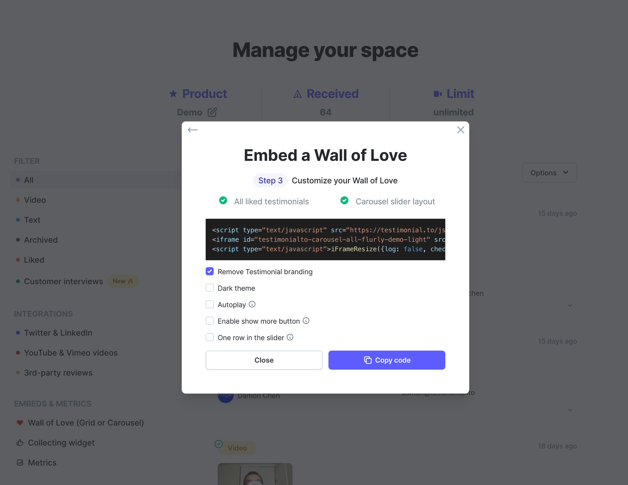
- Remove Testimonial branding (available for paid plan users)
- Choose the dark/light theme
- Let the carousel slider autoplay. It slides every 5 seconds
- Enable show more button (automatically add show more button if text content is longer than 5 lines)
- Show only one row in the slider
- Set the same height for all videos
Same height for all videos is a hidden option at first. It only shows up when the One row option is checked. And this option will only take effect when all testimonials are video testimonials, not including YouTube/Vimeo videos.
Here is a live demo for the same height (Source from scrimba.com):
Selected liked testimonials
Unlike All liked testimonials option, Selected liked testimonials will display only selected ones from all the liked testimonials. And you can create up to 2 selected Wall of Love.
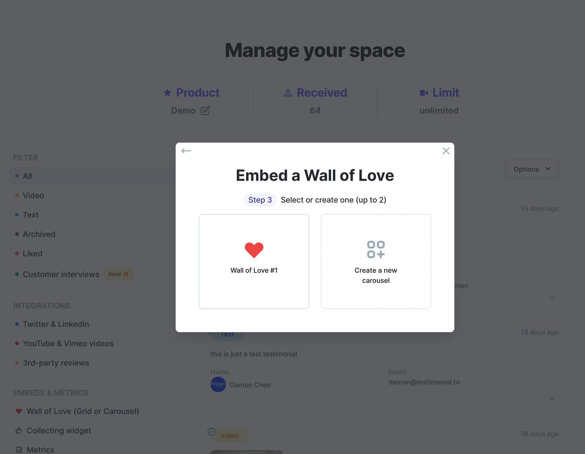
If you click the Wall of Love #1, you will see Step 4 below:
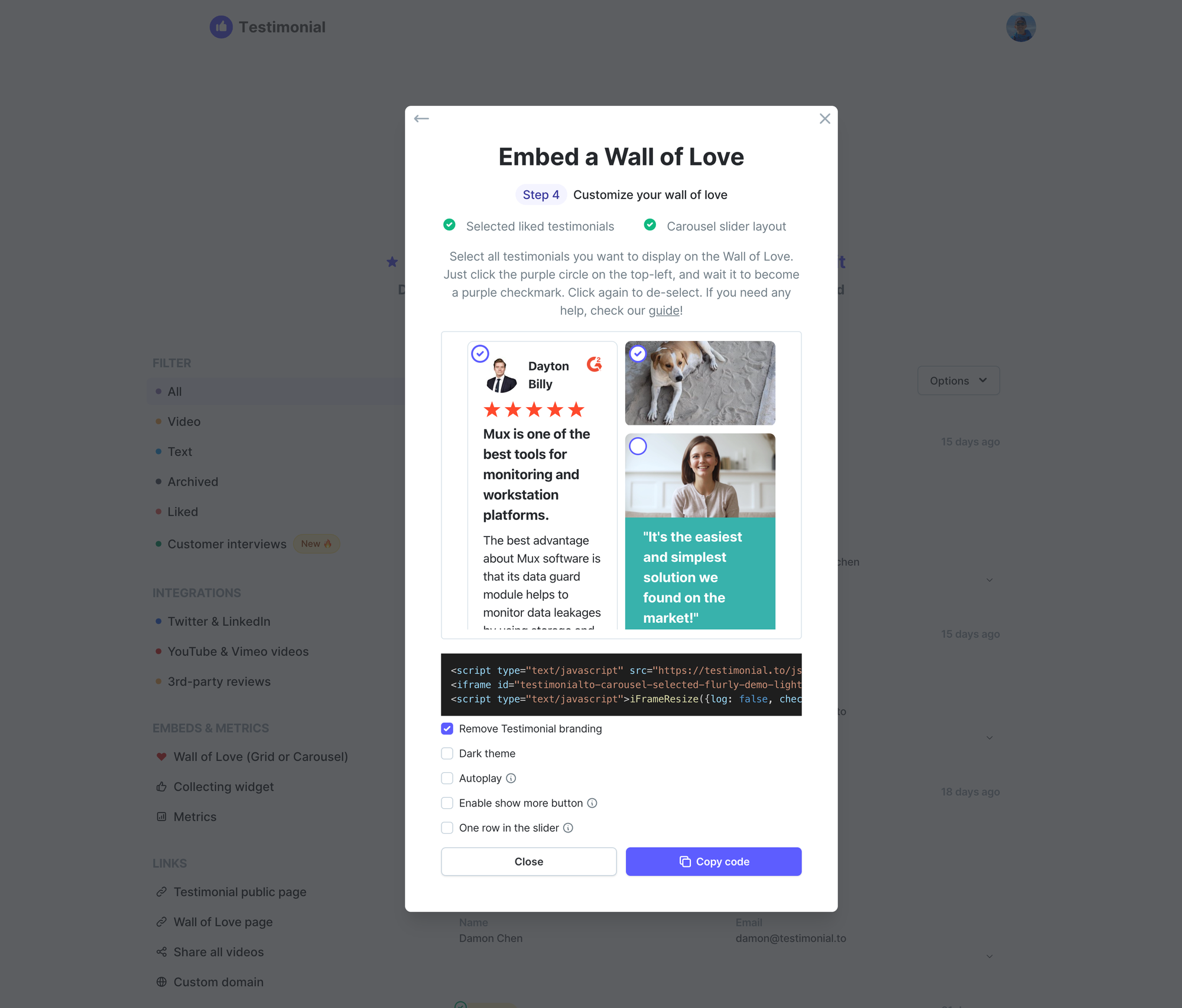
Just click the purple circle on the top-left inside each testimonial, and wait for it to become a purple checkmark. Click again to de-select.
Some hidden configurations for the carousel slider
Adaptive height
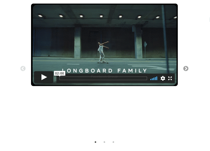
By default, the adaptive height is off. What it means is the height of the whole carousel slider has the same height as the highest slide. So you will see the position of the left & right arrows stay fixed no matter where the side is, something like below.
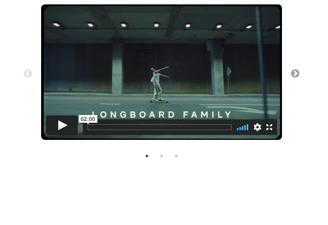
When the adaptive height is turned on, the height of the whole carousel is always having the same height as the current slide/slides. So you will see the position of the left & right arrows keeps changing, and always stays in the middle, something like below:
To enable the adaptive height, you need to append
adaptive-height=on to the embed URL, just like the following, you will see adaptive-height=on at the end.https://embed.testimonial.to/carousel/all/flurly-demo?theme=light&one-row=on&one-slide=on&adaptive-height=onHide dots
You can choose to hide dots beneath the slider if you want
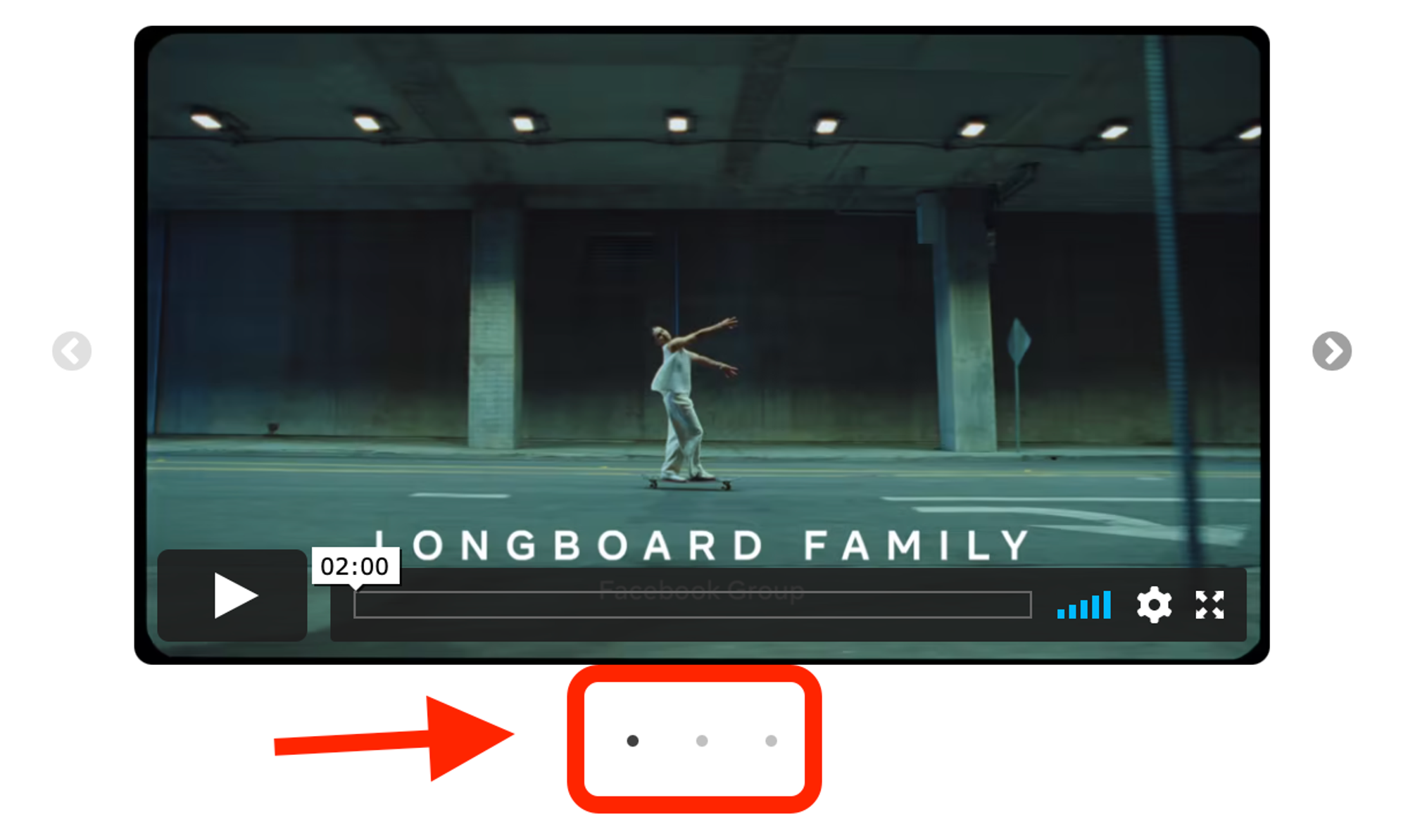
To hide dots, you need to append
hide-dots=on to the embed URL, just like the following, you will see hide-dots=on at the end.https://embed.testimonial.to/carousel/all/flurly-demo?theme=light&one-row=on&one-slide=on&hide-dots=onOne slide (can only be applied to one-row slider)
The following configurations can only be applied when one row in the slider is enabled.
When one-slide is turned on, the one-row slider will only show one slide card at a time. You need to append
one-slide=on to the embed URL, just like the following, you will see one-slide=on at the end.https://embed.testimonial.to/carousel/all/flurly-demo?theme=light&one-row=on&one-slide=on